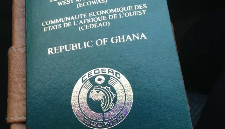
The crest on the cover? The colour of the booklet? Those intricately designed inner pages? There’s a reason for every element of your passport’s aesthetic.
Pity the poor passport. Essential though it is for travel abroad, and for proving that we are who we are at home, it’s fated to spend its time hidden away for safe keeping, its pages rarely scrutinised by anyone but weary bureaucrats.
Its twin tasks are to distil the identity of both bearer and issuing nation, but it often leaves us cringing at our own photographic likeness and puzzling over the antiquated sense of nationhood that crests and gilt lettering convey. And yet, the passport is an artefact rich in visual and historic narrative – one that gestures to our universal similarities even as it highlights borders.
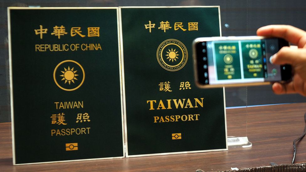
Traditionally, passport design has rarely invited curiosity. For instance, Taiwan’s design – a dark green jacket emblazoned with a stylised sun shining from within a plain gold ring – is typical of administrative aesthetics at their most staid.
Recently, however, the island’s pro-independence New Power Party set about crowdsourcing images for a redesign via a competition. There was a pointedly political dimension. The contest came about in response to a resolution passed in parliament in July to emphasise the word “Taiwan”, which on existing travel documents sits below the words “Republic of China”, causing, legislators argued, confusion abroad. The majority of finalists took it a step further, not through their choice of motifs, which were both playful and traditional, but via a crucial omission: those three English words, “Republic of China”, were nowhere to be seen.
Nevertheless, the sheer exuberance of the designers’ re-imaginings, ranging from birds and butterflies to heaped bowls of rice, all adorning covers of pinks and purples, yellows and oranges, raises a broader question: why must passports look the way they do?
From vellum to booklets
Passports haven’t always been the stiff-backed booklets that we use today. The earliest reference to a passport-like travel document occurs in the Bible’s Book of Nehemiah, which describes how, in around 450BC, the prophet was granted letters from Persia’s King Artaxerxes I, requesting that rulers of lands beyond the Euphrates grant him safe passage to Judah. The Arthashastra, an ancient Indian Sanskrit treatise on statecraft thought to have been written sometime between the 2nd Century BC and the 3rd Century AD, also refers to passes issued for a fee, without which no native of the country may leave or return.
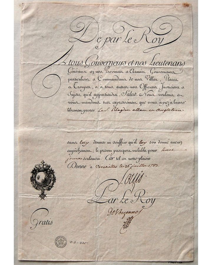
We can’t know what these documents looked like, but it’s quite possible they resembled the world’s oldest surviving passport. Written on vellum in a clear, ornate hand, it included England’s King Charles I signature, and, being far from pocket-sized, has been folded many times. It was issued in 1636 to Sir Thomas Littleton, permitting him “to passe out of this our realme into the part beyond the Seas”. He was entitled to take with him four servants, £50 and his “trunckes and necessaries”.
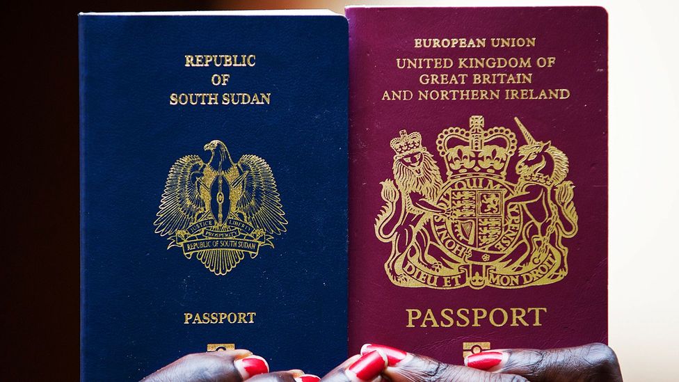
With the outbreak of World War I, governments looked to passports as a way of preventing foreign spies from entering their border. The first recognisably modern British passports were issued in 1915. Made of a single sheet of paper, these documents were folded into a cardboard cover bearing the UK’s royal coat of arms. That same unicorn and lion – which represent Scotland and England, respectively – grace today’s passports, along with its two motoes (in French, since they date back to a time in history when Norman French was common currency among the English elite): dieu et mon droit (God and my right) and honi soit qui mal y pense (shame on he who thinks evil of it).
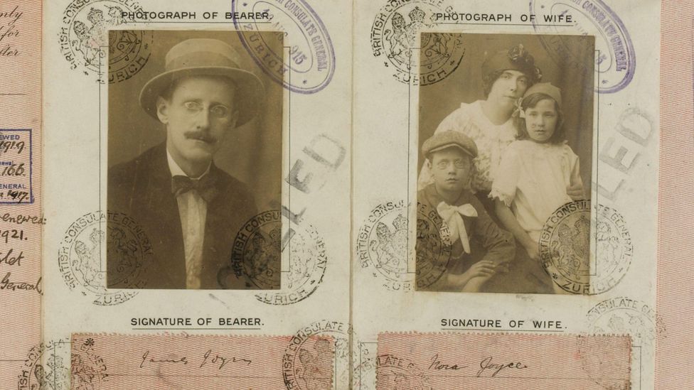
Inside, it’s very different. While the 1915 version was the first to require a photograph, those early mugshots bear scant resemblance to today’s strictly regulated digital portraits. Consider Arthur Conan Doyle’s passport photo of a hundred years ago, in which he appears alongside his wife, with their two sons seated in a dog cart (an entire family could travel on a single passport). In the same era, Randall Davison, then the Archbishop of Canterbury, got away with full formal attire, including his ceremonial staff. Scroll through antique passports and you’ll find people posed in their gardens or at the seaside, toting cigarettes, newspapers and musical instruments. There is nothing official about them – and their sense of character is all the more piquant for it.
These images weren’t always effective as proof of identity, however. In his book The Passport in America, academic Craig Robertson relates the tale of a moustachioed Dane who travelled to Germany. While there, he learnt that large moustaches were considered too reminiscent of the Kaiser Wilhelm and so shaved his off. When he attempted to leave, passport officials turned him back because he no longer looked like his passport photo, resembling instead a notorious swindler.
It wasn’t until the war’s aftermath, in 1920, that the League of Nations sought to impose an international passport standard as part of its mission to preserve world peace. Among its stipulations were pagination (32 pages in all), the use of at least two languages and a cover bearing the nation’s name at the top, its coat of arms in the centre and the word ‘Passport’ at the bottom. These regulations have come to define modern passport design.
The essence of a nation
Today, the International Civil Aviation Organisation, a branch of the UN, is responsible for issuing passport standards governing the likes of cover size and format as well as technology. But nothing in its regulations stipulates what colour the cover should be.
Most of the world’s passports are three colours: red, blue or green. So, why the restricted palette? It’s generally accepted that blue passports are favoured by New World countries, red alludes to a Communist past or present and green often indicates Islamic nations. There’s also a feeling that a cerise-pink passport, for instance, might make an excellent tourist board advertisement, but could imply frivolity – a trait that no nation state cares to project, however much the world could use it. (Slovenia perhaps comes closest, its passport doubling as a flip-book thanks a horse-mounted figure that gallops up the side of its pages.)
The power of design conformity is not to be underestimated. Just consider the saga of the UK’s recent colour change. In the wake of the Brexit vote, the British government declared that the passport would be returning to its original blue. In fact, no EU law existed requiring it to remain burgundy in the first place. It was changed willingly in 1988, to fit in with other member states.
Within their covers, passports increasingly try to convey more of a local flavour, packing their pages with national monuments, natural wonders and noteworthy citizens, as if they were civics primers.
Until the plainer blue passports came in this year, the UK’s inner pages included line drawings of Anthony Gormley’s Angel of the North sculpture; the painter John Constable; and the first computer programmer, mathematician Ada Lovelace. Shakespeare’s head was embedded on each page as a watermark. Japan’s new passport features no fewer than 24 works from Katsushika Hokusai’s iconic woodblock series, Thirty-six views of Mt Fuji, and America’s most recent complete redesign, released in 2007, includes an engraving of the battle that inspired The Star-Spangled Banner along with Mount Rushmore, long-horned cattle and a clipper ship.
Sometimes, these carefully curated contents can send unwitting messages: it’s almost a century since married American women have been able to get their own passports, rather than travelling on (and therefore always with – they couldn’t cross a border solo) their husbands’. However, among the 13 inspirational quotes from influential Americans that fill the pages of the current design, only one is attributed to a woman, prominent African-American scholar Anna Julia Cooper. It’s a far cry from Gabon’s passport which, up until its biometric redesign, might just have been the world’s most gynocentric passport, thanks to a cover displaying an image of a bare-breasted mother nursing an infant.
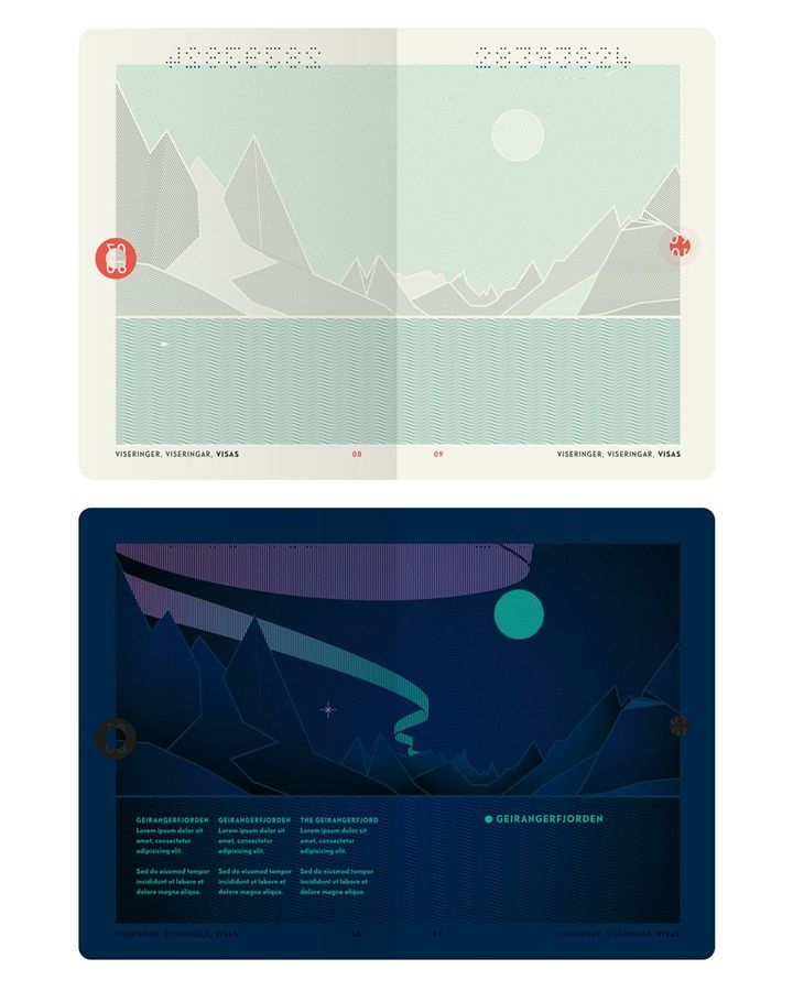
Yet patriotic though they seem, these design features are dictated by a prime driver of passport design: not aesthetics but security. Simply put, the more elaborate a passport’s pages, the harder it is to forge. Some of the whizziest features of the modern passport are also due to security concerns; consider, for instance, Canada’s 2015 redesign. Shine a UV light on its pages and the skies above its otherwise fairly standard scenery flare with vibrant firework displays, bright constellations and a rainbow’s arc. At the turn of the millennium, when another otherwise hidden security feature, the biometric chip, began to be added globally, it meant that a new symbol appeared on the jacket of any passport carrying one.
As for the Taiwanese redesign, in the end, the government decided against bubble tea and bears. The new version looks incredibly similar to the old, the critical difference being that the English words “Republic of China” are minimised, now encircling the sun rather than floating above it in a much larger font.
It certainly doesn’t rival Norway’s 2014 redo, by Neue Design Studio, which riffs on the theme of the fabled Norwegian landscape and comes in three colours, white, turquoise and vermillion, nodding to convention while looking bracingly contemporary. Inside, they’re as Nordically minimalist as you could wish for – but a UV beam makes the Northern Lights appear.
Similarly different
Norway’s passports remain the exception. On the whole, no matter how divergent the nations they represent, a passport will always more closely resemble another passport than anything else in this world, whether it’s Chinese or American, Australian or Iranian.
In this way, their sober designs undermine their very purpose, accentuating not the individuality of each issuing nation but their deep similarities – a hunger for stature on the global stage, for the substance that history confers. In a world in which crests are rarely used, one looks very much like another. Ditto the flora and fauna: while Japan’s chrysanthemum, Lebanon’s cedar, and Lesotho’s crocodile and ponies all are intricately woven into the tapestry of their country’s national identity, embossed in gold on a colour conveying officialdom above all, they can look strikingly alike.
However much passport iconography harks back to the past, the world continues to hurtle forwards, altering not just the technology that these documents contain (and how long before passports go paperless?) but also what they represent. Passports have always held different meanings for different people. To the lucky ones, secure in their sense of home and belonging, it’s a key that unlocks the wider world, representing adventure and flight; to those swept up in tides of migration, that same document symbolises the promise of a restful end to all that, and being allowed to stay put. Simmering international tensions have long meant that some passports open more doors than others, but with the outbreak of the current pandemic, travel has become prohibitively complex for many of us.
In this way, Covid-19 has added yet another layer of meaning to that small, glittering booklet, glossing it with nostalgia and longing even as it gathers dust.


